Online advertising budget? Check.
Compelling, clickable ads? Check.
Seductive post-click marketing? Hmmm...what?
The click through from your online advertising to its destination is post-click marketing...and it may be your first moment of truth in digital marketing. People judge the quality of their post-click experience within 1/20th of a second. Whether you are driving those clicks to your home page or a highly targeted landing experience, a first impression is made.
According to Google, the zero moment of truth is "that moment when you grab your laptop, mobile phone or some other wired device and start learning about a product or service (or potential boyfriend) you’re thinking about trying or buying."
So why is ZMOT important?
- 70% of Americans read product reviews prior to making a purchase
- 79% of consumers use a smart phone to help with shopping
- 83% of moms say they do online research after seeing TV commercials for products that interest them
These numbers may not be so surprising any more. But they shouldn't be taken for granted.
A great first impression will lift the perception of your brand for everything that follows. Every online experience should communicate your brand in a relevant and highly impactful way. However, compelling design for landing experiences is often underutilized. Landing pages are mechanically cranked out with same plain, boring “recipes” — headline, subhead, bulleted list, call-to-action. But, alas, creating high performance pages is not formulaic. You can stand out by having your landing experiences reach through the screen and grab your audience’s attention and mindshare. Post-click marketing presents a tremendous opportunity for you to gain a competitive advantage.
Disclaimer: there is no guarantee that any of the below strategies will increase conversions for you. However, I have worked with dozens of customers who have increased their ROI with seductive post-click marketing.
RELATED TUTORIAL: B2B Landing Page Best Practices for Success
Below are 5 ways to drive awesome response rates with great post-click marketing experiences.
1. The Segmented Experience
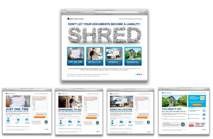
Unlike traditional landing page optimization, which usually focuses on testing and optimizing page elements, segment optimization focuses on identifying who your audience is, then optimizes unique visitor experiences. Instead of stretching one page to try to please everyone, which is quite hard to do – segment optimization breaks out several specialized landing pages. Iron Mountain knows that all clicks are not created equal. Keyword searches for "shredding services" can be an enterprise looking for an ongoing shredding service. Or, it could be an individual looking for safe way to dispose of a box of confidential documents. The landing page below asks the visitor to identify their need immediately. Residential visitors are directed to Iron Mountain's partner locator. Businesses are provided with targeted pages of content, outlining the process for one-time, pick-up and drop-off services. By identifying individuals up front, Iron Mountain was quickly "weed out" unqualified leads and get them to a trusted local partner.
2. The All-Mighty Microsite
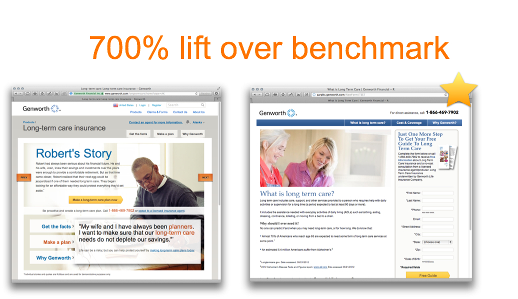
A landing page or website must be all things to all visitors. But a microsite can deliver a highly differentiated subset of information to a highly targeted audience. You can create multi-page, navigable user experiences to deliver rich, topic or campaign-specific content. Microsites are also the perfect venue for complex products or solutions and can be highly effective at converting "upper funnel" keywords. In this example, testing a lead-gen focused microsite against the Long Term Care product page within Genworth.com, leads increased 700% over the benchmark! The ion platform allowed Genworth the flexibility to created a dedicated lead capture microsite experience, without requesting changes to the corporate website.
3. Social Login
According to the 2011 Blue Research report, “Consumer Perceptions of Online Registration and Social Login,” 77% of consumers believe social login should be offered — this is up from 66% in 2010. Additionally, nearly 8 in 10 consumers would prefer to login to sites using a social identity, versus traditional account creation. Offering the option of signing in with a social login (e.g. Facebook or Twitter) as an alternative to filling out a form has several benefits:
- Improved user experience
- Reduced form fields, reduced friction
- Improved accuracy of data collected
We too have seen the addition of social login (or sign on) increase lead conversions when offered alongside a standard sign up form. I can't share specific results of our testing with iContact, but introducing a social account creation option has resulted in an increase in free trial sign ups. Testing of placement, design and network offering has provided meaningful learning at an ad group level.
I also love this experience because it includes a progressive form experience within the traditional account creation form.
4. Progressive Conversion
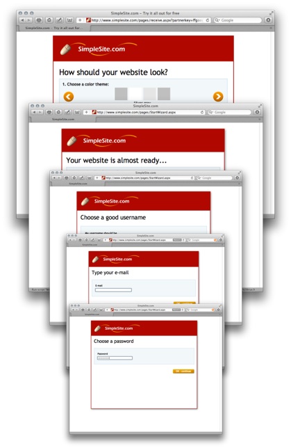
So what the heck is progressive conversion anyway? Well, progressive conversion recognizes that sometimes people need multiple interactions with you, either in a single session or across multiple visits, before they are ready to convert. One of my all-time favorite progressive experience is one I found while curating examples for our R.E.A.D.Y conversion best practices series. SimpleSite.com does a fantastic job of gently guiding the user through several steps before asking for lead information. The visitor is guided through the site "creation" process in a logical, step-by-step fashion to establish trust, build commitment and earn the end-goal conversion action.
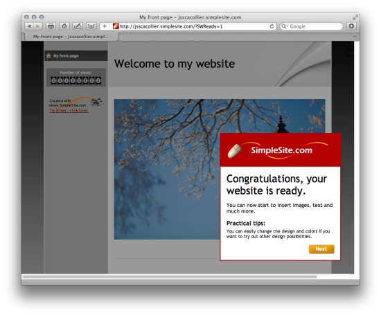
With multi-step experiences, you “pay off” the previous click and encourage visitors to continue moving through the conversion funnel. Once login is created, users get an immediate pay off…the site is “ready”!
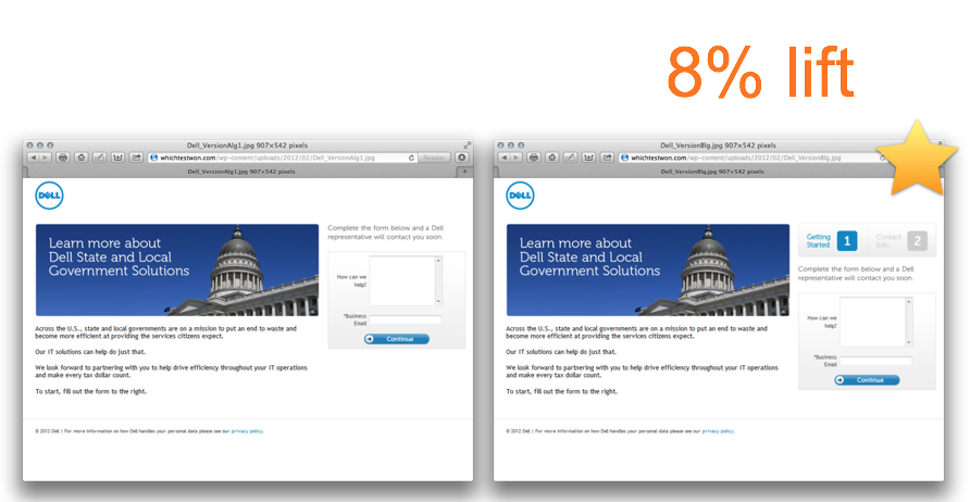
Additionally, according to a survey from Pit Stop Media 52% of online retails use some sort of progress bar during their checkout process, and among those, 80% use some sort of sense of action or “moving forward” indicator through arrows or next page links. In this example (a Which Test Won Gold Award-Winner) adding step indicators to Dell’s 2-step form improved lead conversions by 8%.
This test may seem like a no-brainer, and honestly, it is — very little resource investment is needed to create two form images to help drive conversions. But, the smartest part is hidden in the form. Dell asks an easy entry question “how can we help you?” followed by a required email address. Even if the user drops off on the second form, Dell has still captured email address for nurture and re-marketing. Smart!
5. Device Optimization
Generally speaking, there are two ways to implement device optimized landing pages:
- Use responsive design -> pages adapt to the appropriate device
- Create native mobile pages -> pages are explicitly designed for that purpose
With responsive design, you can create one version of your pages that look good across all devices. At ion, we have an awesome responsive SEO pages that looks great on my iPad, iPhone and iMac (oh and on a PC too). However, for our pay-per-click landing experiences we create native mobile landing pages.
These are intentionally designed for conversion. We decide what content, imagery, form fields and interactive elements are included. Longer forms are substituted with shorter, finger-friendly forms. Content rotators are replaced with static images. Navigation is removed. I love responsive web design. I love native mobile landing pages. I encourage you to find a software that allows you to create, test and optimize both types of device optimized pages. The choice should be yours!
The fact that excellent design is not formulaic is a good thing, as it enables marketers to differentiate from the competition.
Have you tried one of more of the five strategies above? I'd love to hear your testing stories and other innovative ways you are taking advantage of your customer's "moment of truth." Comment below, or tweet me at @jsscacollier!
Learn how to drive more conversions with better landing pages.
Watch B2B Landing Page Best Practices for Success, and discover proven techniques for creating and optimizing high-converting B2B landing pages. Access it FREE with your trial to the Online Marketing Institute. Get instant access now.
